Redesigning the packaging experience for an iconic paint brand.
Driven by a 150-year-long tradition, Finnish colour and paint icon Tikkurila approached Grow seeking to redesign its entire packaging range. Our task was to make sure it correlated with the brand essence “Painting a bigger picture”. Inspiring people to transform their surroundings for a brighter future.
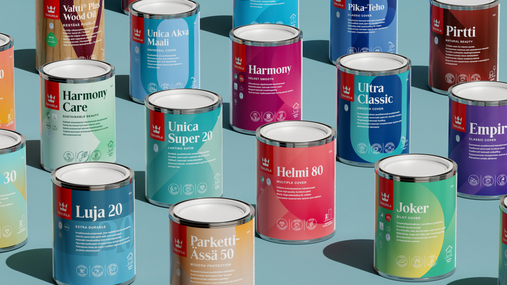
The process began with understanding the portfolio of over 200 products, as well as gathering consumer behaviour insights. There was a need for a design solution that could be easily adapted to different categories and be a good fit for all markets. Supporting Tikkurila in their transformation from a diverse, functional-driven brand to a more contemporary, inspiring, and emotional-driven one.
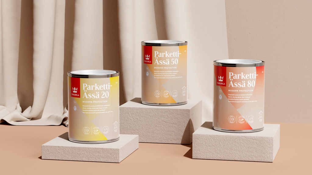
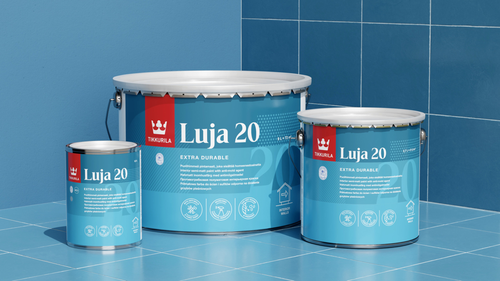
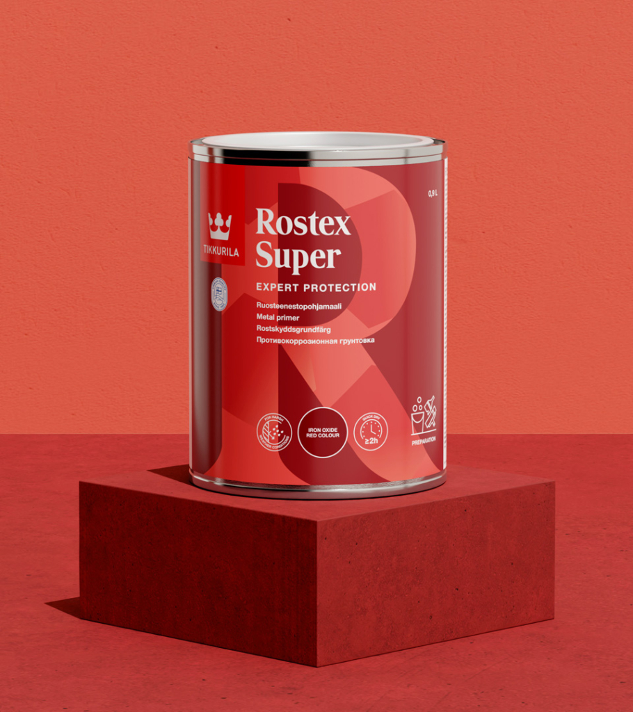
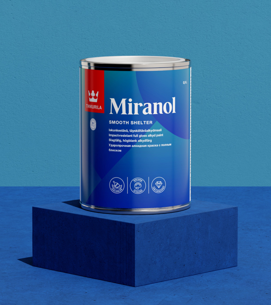
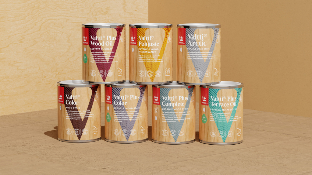
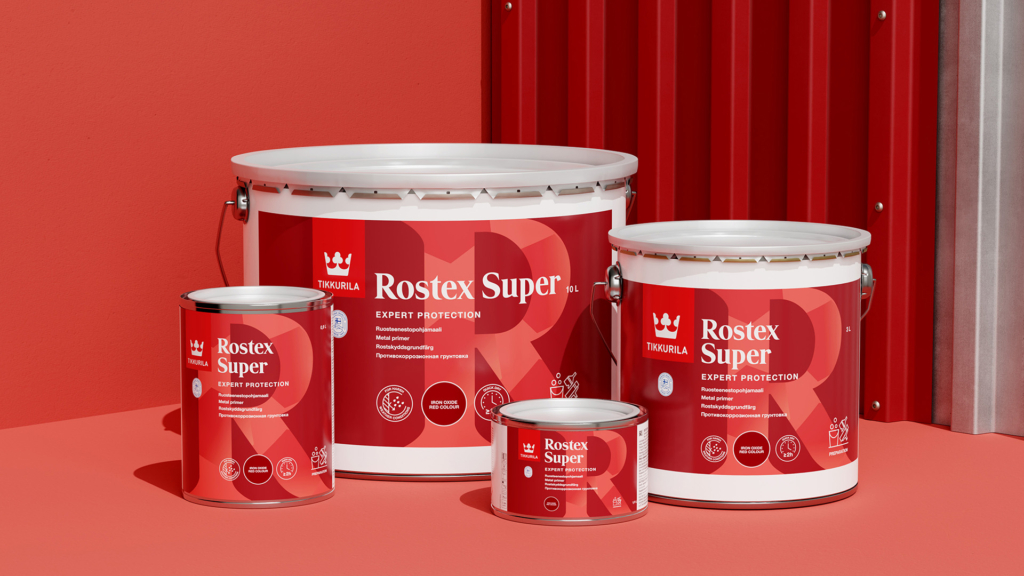
We knew that simplicity and a strong visual expression would be essential, so we formed a design strategy inspired by Scandinavian expressions built on strong colours with individual patterns, contemporary typography, and a consistent informative navigational system. We also developed a full library of icons to
lift each specific family, product and their benefits.
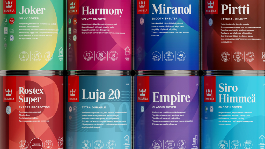

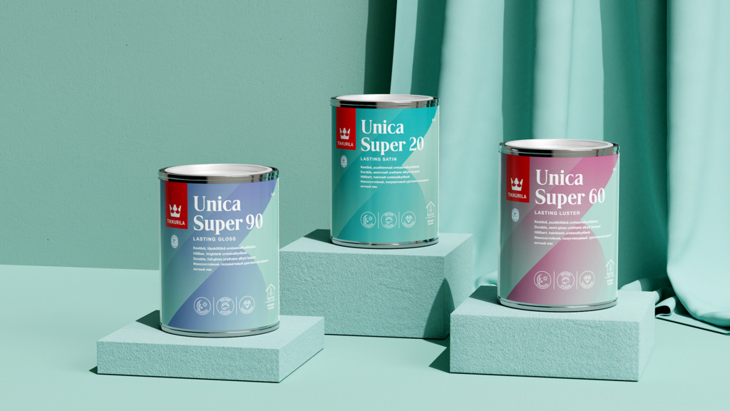
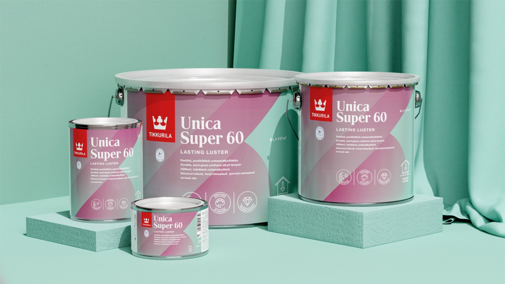
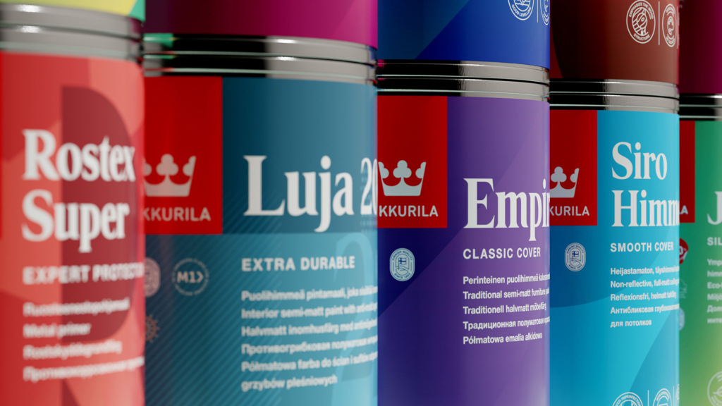
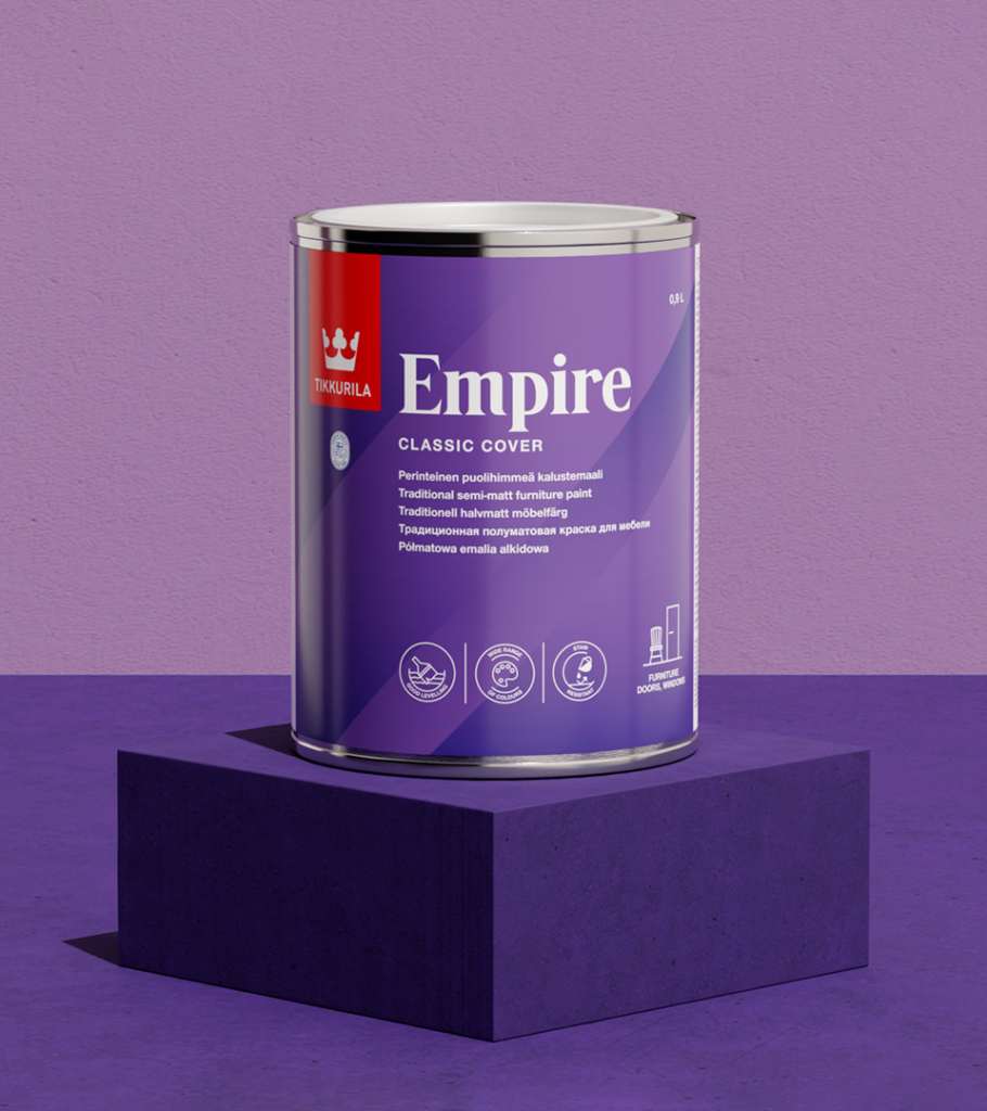
There was a strong need for a visual expression with its own characteristics, targeting a specific audience.