Coop
Private label
design that
tastes better
Challenge
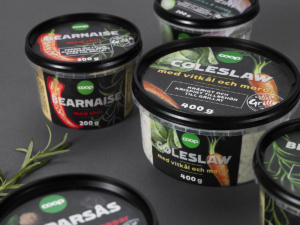
How do you merge and strengthen Coop as a brand, and still be clear on specific expressions and codes relevant for each category? That was the topic when Grow was assigned to design a series of private label brands.
Packages can be refilled to offer greater flexibility, allow for the creation of personalized cosmetics.
Solution
When everything works well, and what is good leads to something even better – then you are in a virtuous circle. For Coop, this is when their goods are not only inspiring, tasty and affordable, but they have also been produced in an environmentally friendly and sustainable way.
The circle is also a symbol for wholeness; a life circle where food, caring and sustainability in all aspects are central. Last but not least, the circle can be seen as a plate, the set table where family and friends gather. In the middle of life. A perfect symbol for Coop, if you ask us.
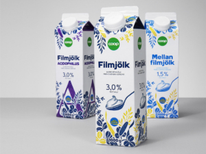
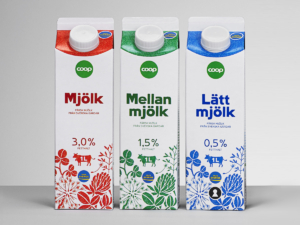
Using the font Coop New horizontally throughout all categories makes a strong impression. Creating new weights within the Coop New font family typography gives space to play a little when differentiating products from one another.
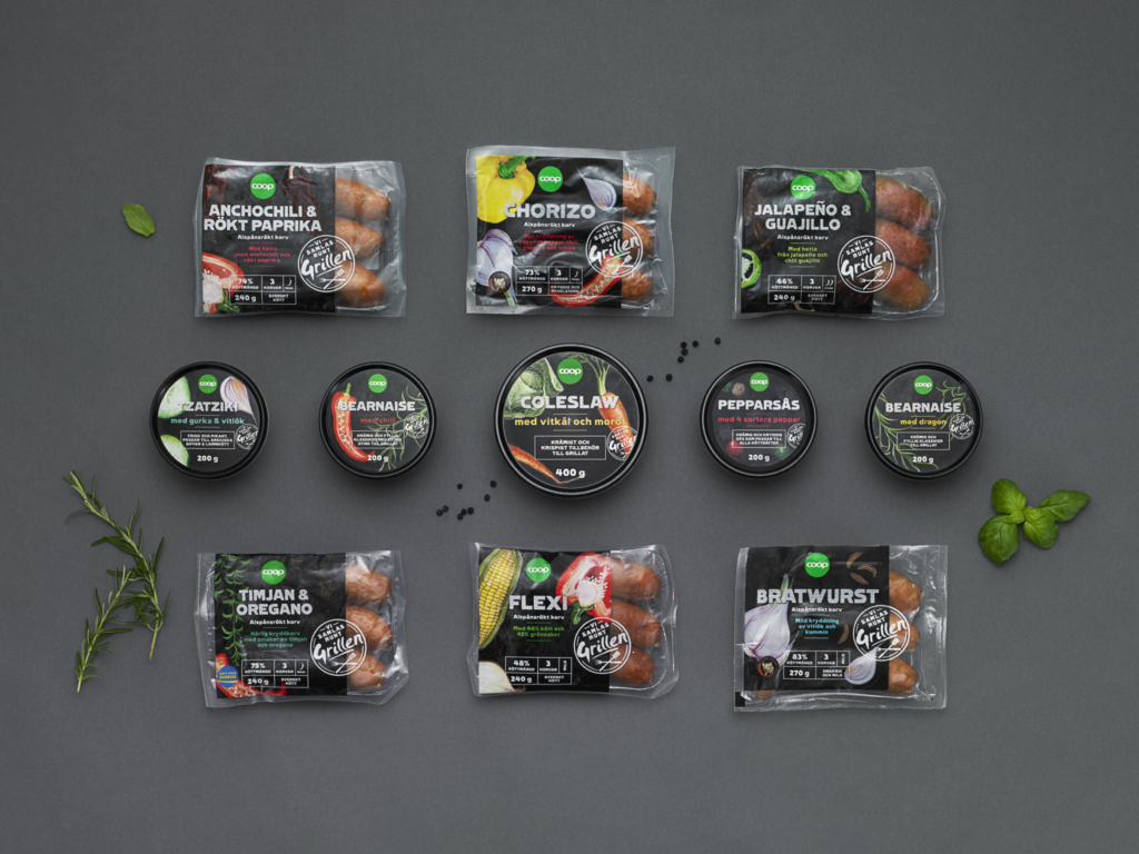
“Let’s gather by the grill”.
We gave Coop Barbeque range an unpretentious yet distinct look. A barbeque world of togetherness.
If you want to know more, contact Elsa Victorin.