Eniro
Designing a
new way forward
Challenge
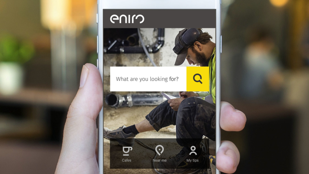
How do you change the perception of an already well-known and existing business? To reflect Eniro’s strategy and changed business model to become a digital marketing partner for small and medium-sized businesses, we were assigned to develop a new visual identity. Early on, we were convinced that their new image and approach must be visible and felt to implement the new direction.
The idea of openness has driven the design
of the new visual Eniro identity.
Solution
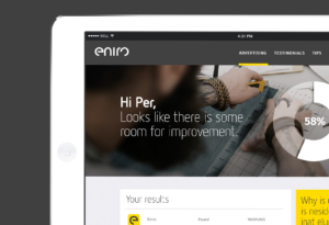
Eniro means “Opening” in Esperanto, which was also the conceptual theme of our approach based on a deep and comprehensive visual audit. Giving access to, or opening the door to new findings, discoveries or experiences is what Eniro does for its customers and users. To truly be experienced as a digital first brand, in the minds of customers and users, the new design needed to support this by making it inspiring, flexible and adaptable.
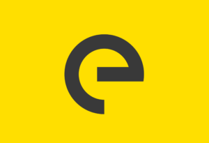
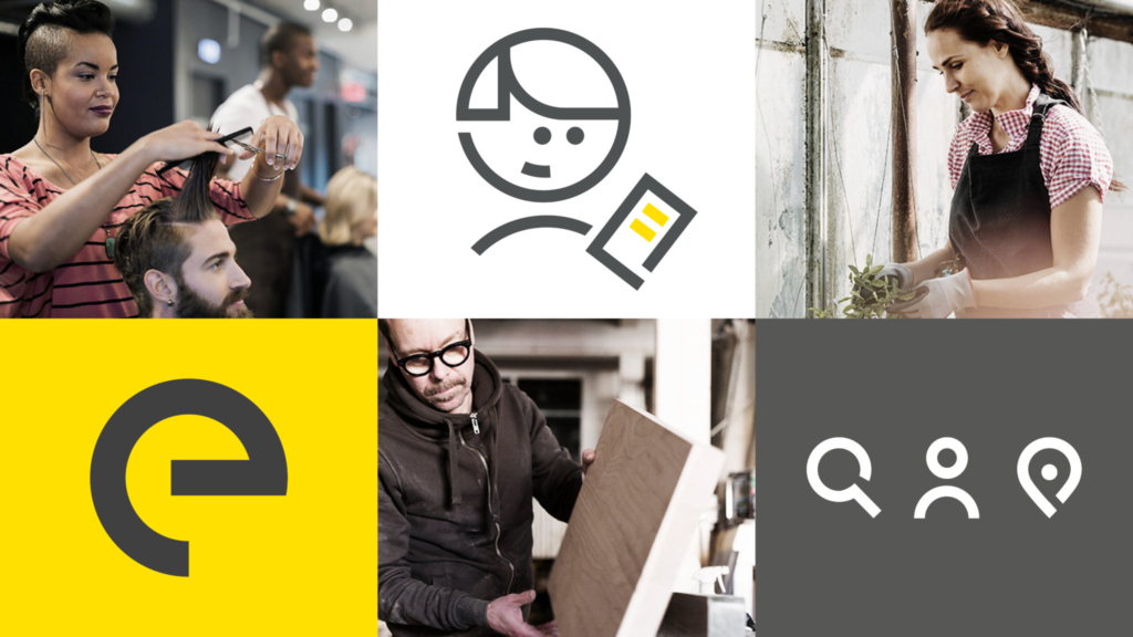
By embracing the yellow colour and combining new and existing values, the profile builds forward on a strong heritage. The open shaped logotype is at the heart of the brand and represents everything that is Eniro. Therefore, the idea of openness has driven the design of the new visual Eniro identity, all the way from the distinct wordmark to typography, imagery, icons and illustrations. In all, making it more joyful and easy to find and discover new things.
The new design needed to support the idea of opening the door to new findings, discoveries or experiences by being inspiring, flexible and adaptable.
If you want to know more, contact Elsa Victorin.